
Fort Payne Police Station
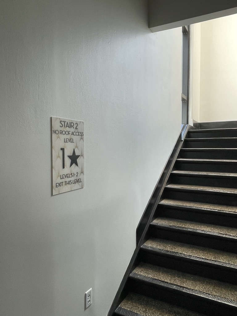
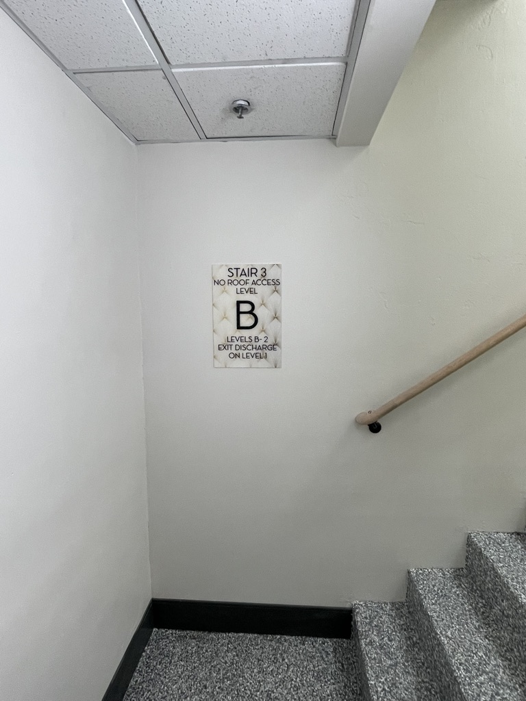
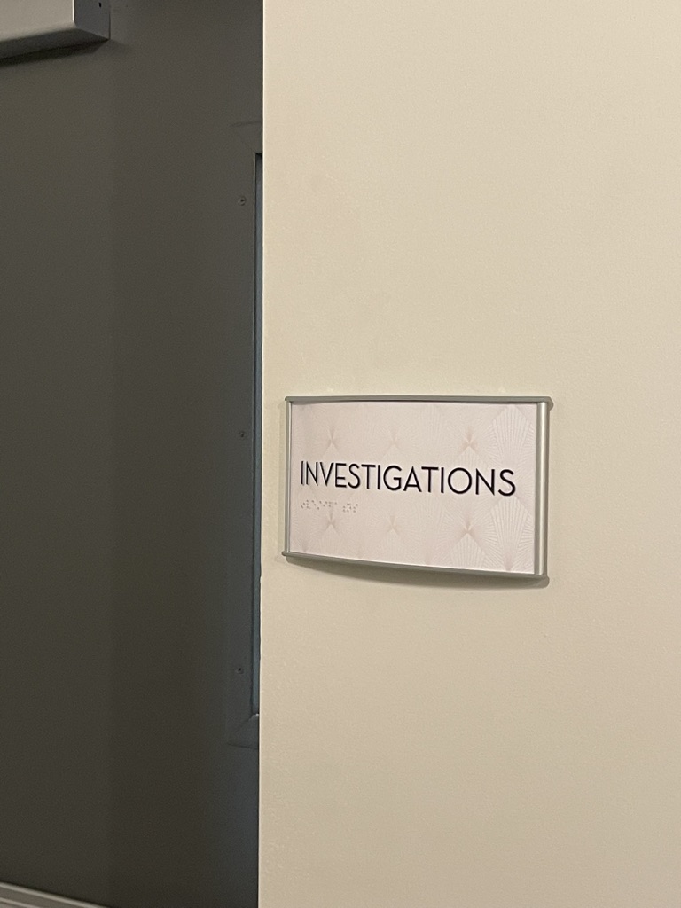
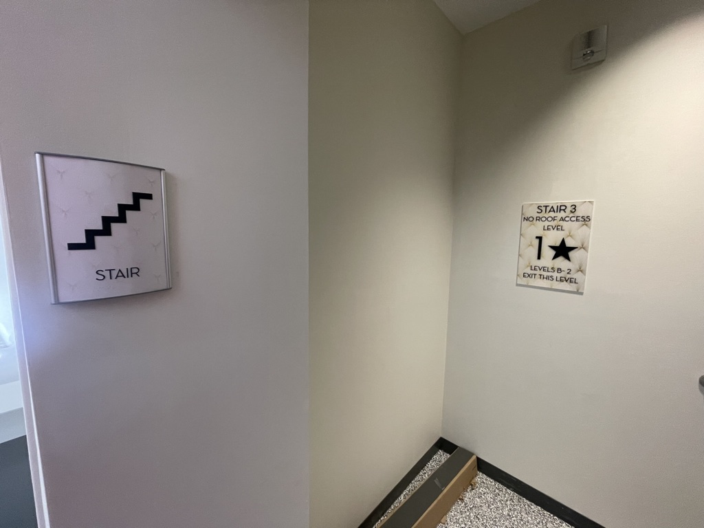
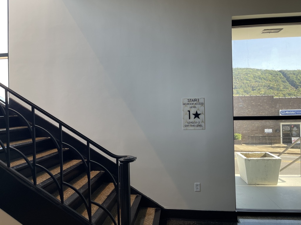
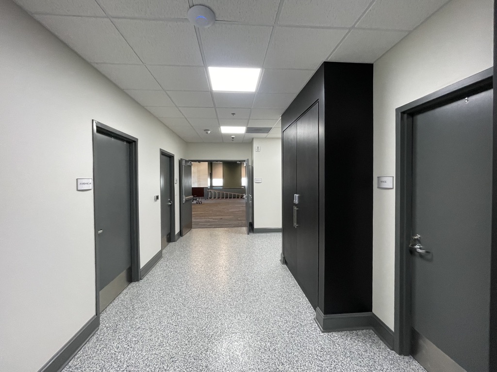
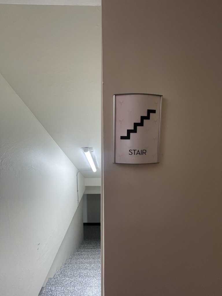
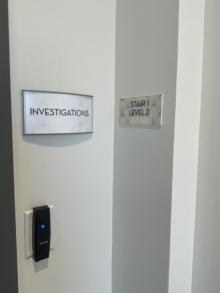
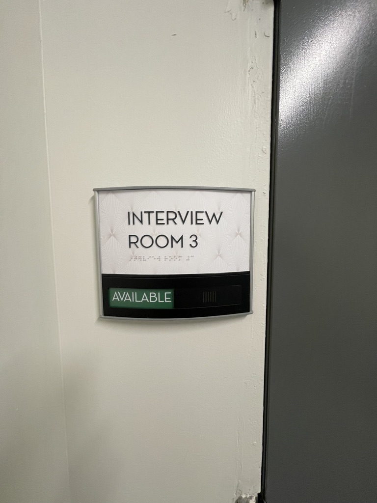
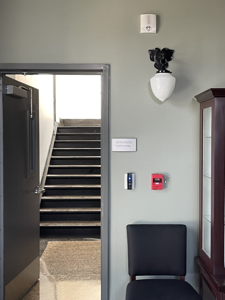
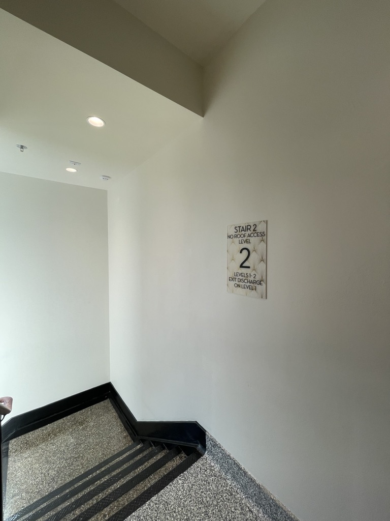
We were honored to partner with Tinker Ma and Sam Construction on the Fort Payne Police Station project in Alabama—a collaboration that brought together thoughtful design and historic preservation. The building itself is a beautifully preserved example of Art Deco architecture, and its strong visual identity immediately inspired our creative direction. Our goal was to develop a signage system that would reflect the timeless elegance of the space while also aligning with the client’s request for cost-effective, non-custom solutions. To strike this balance, we carefully selected Ace Sans Roman as the primary typeface for room identifiers and directional signage. Its clean, modern lines harmonize well with the geometric detailing characteristic of the Art Deco era, providing a contemporary feel without overshadowing the historical context. We also designed a custom suite of minimalist yet elegant pictograms that complement both the architectural style and the practical needs of the space. These icons add clarity and accessibility while maintaining a refined aesthetic. One of the most visually distinctive elements of the signage system is the use of an Art Deco–inspired pattern, subtly integrated into the sign inserts. This pattern draws on the geometry and rhythm of classic Deco motifs, offering a nod to the past while keeping the design fresh and approachable. The final result is a cohesive signage system that bridges the gap between old and new—paying homage to the building’s legacy while serving the functional needs of a modern police station. This project is a great example of how thoughtful design can enhance public spaces in meaningful and lasting ways.